radio组件是常用的按钮组件。
目录
一、综述
二、DOM结构
三、样式
四、属性
五、方法
六、事件
七、操作
八、案例
一. 综述
radio组件组件是常用的按钮组件,主要用于radio按钮的展示。
组件路径:/UI2/system/components/justep/button/radio
组件标识:$UI/system/components/justep/button/radio
二. DOM结构
- 典型dom结构1
<span component="$UI/system/components/justep/button/radio" class="x-radio"
  xid="radio1" label="是" name="yes" value="1"
  checkedValue="1" checked="true">
</span>
- 典型dom结构2
<span component="$UI/system/components/justep/button/radio" class="x-radio"
  xid="radio2" label="是" name="yes"
  bind-ref="data1.ref('status')">
</span>
三. 样式
- x-radio
组件标识class,基础的样式定义
- x-radio-lg
radio组件显示大图标
- x-radio-sm
radio组件显示小图标
- x-radio-xs
radio组件显示中图标
四. 属性
组件具有公共属性,请参考组件公共属性
- name
组件name,等价于html中的name属性,相同name的Radio为一组,选中是互斥的
- label
显示名
- checked
是否选中
- checkedValue
选中后的value,checkedValue如果设置了,选中后是这个值,否则是null或undefined,如果没有设置,选中后是true,没有选中是false,把这段话加上
- bind-ref
数据感知的绑定表达式
- disabled
禁用
五. 方法
组件具有公共方法,请参考组件公共方法
- set
void set (json arg)
设置属性值
>参数
arg 属性值对 json结构如下:
{
“disabled” : 禁用,
“label” : 显示名
“checked” : 是否选中
“name” : 组件name,等价于html中的name属性,相同name的Radio为一组,选中是互斥的
> 返回值
void
> 例:
//设置组件属性值
this.comp('radioTest').set({'checked':'true'});
- get
Object get (String name)
获得radio属性值
> 参数
name:
>返回值
Object
> 例:
//获取radio组件的属性值
 this.comp('radioTest').get('checked');
 this.comp('radioTest').get('disabled');
- val
void val ()
给radio组件赋值或者取值,不填参数表示取值,使用绑定的data的当前行字段也可以取到这个值。还可以通过js操作改变radio组件中的值。
> 参数
无
>返回值
void
> 例:
var radioObj = this.comp('radioVal');
//获得radio的值
  radioObj.val();
//给输radio赋值
  radioObj.val('444444');
六. 事件
public void onChange (object event) [回调型事件]选中状态变化触发事件
>参数
object event
event结构如下:
{
  "source" : 组件的js对象,
  "checked" : 选中状态,
  "value" : 对应的值
  "bindingContext" : 组件绑定的上下文,包含$model、$object等具体请参考bindingContext说明
}
>例
Model.prototype.radioChange = function(event) {
  Message.message("aler", "radio change事件,获取value值");
  this.comp("showValue").set({"value":"选择的值:"+this.comp("radioVal").value});
};
七. 操作
- (无)
八. 案例
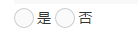
1、radio横排显示
- radio组件正常显示。
代码示例:
<span component="$UI/system/components/justep/button/radio"
  class="x-radio" xid="radio1" label="是">
</span>
<span component="$UI/system/components/justep/button/radio"
  class="x-radio" xid="radio2" label="否">
</span>
2、radio竖排显示

- 通过在源码中加入换行符,实现两个radio竖向排列。
代码示例:
<span component="$UI/system/components/justep/button/radio"
  class="x-radio " xid="radio3" label="是">
</span>
<br/>
<span component="$UI/system/components/justep/button/radio"
  class="x-radio " xid="radio4" label="否">
</span>
3、两组radio
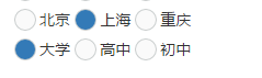
- 展示两组不同的radio。
代码示例:
<span component="$UI/system/components/justep/button/radio"
  class="x-radio" xid="radio14" label="北京" >
</span>
<span component="$UI/system/components/justep/button/radio"
  class="x-radio" xid="radio15" label="上海" >
</span>
<span component="$UI/system/components/justep/button/radio"
  class="x-radio" xid="radio16" label="重庆" >
</span>
<br xid="default1"/>
<span component="$UI/system/components/justep/button/radio"
  class="x-radio" xid="radio17" label="大学" >
</span>
<span component="$UI/system/components/justep/button/radio"
  class="x-radio" xid="radio18" label="高中" >
</span>
<span component="$UI/system/components/justep/button/radio"
  class="x-radio" xid="radio19" label="初中" >
</span>
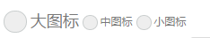
4、3个radio组件都禁用
(1)设置radio组件的disabled属性
- 通过对radio组件的disabled属性进行设置。使disabled设置为true,实现组件的禁用操作
代码示例:
<span component="$UI/system/components/justep/button/radio"
  class="x-radio x-radio-lg" xid="radio5" label="大图标"
  disabled="true">
</span>
<span component="$UI/system/components/justep/button/radio"
  class="x-radio x-radio-xs" xid="radio6" label="中图标"
  disabled="true">
</span>
<span component="$UI/system/components/justep/button/radio"
  class="x-radio x-radio-sm" xid="radio7" label="小图标"
  disabled="true">
</span>
(2)通过javascript操作,实现radio组件的禁用
- 通过编写javascript代码,当点击“禁用”按钮时,触发事件,设置disabled属性的值为true,来实现radio组件的禁用。
代码示例:
//通过设置disabled属性,设置radio组件禁用操作
Model.prototype.button1Click = function(event){
  this.comp('radio8').set({'disabled':true});
  this.comp('radio9').set({'disabled':true});
  this.comp('radio10').set({'disabled':true});
};
<span component="$UI/system/components/justep/button/radio"
  class="x-radio x-radio-lg" xid="radio8" label="大图标" >
</span>
<span component="$UI/system/components/justep/button/radio"
  class="x-radio x-radio-xs" xid="radio9" label="中图标" >
</span>
<span component="$UI/system/components/justep/button/radio"
  class="x-radio x-radio-sm" xid="radio10" label="小图标" >
</span>
<a component="$UI/system/components/justep/button/button"
  class="btn btn-default" label="禁用" xid="button1"
  onClick="button1Click">
  <i xid="i1"></i>
  <span xid="span1">禁用</span>
</a>
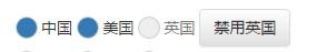
5、禁用1个radio,只能在另外两个中选择
- 3个radio组件,通过js操作,设置其中一个组件的disabled 属性,实现两个可以选择,一个不能选择。
代码示例:
//通过设置disabled属性,设置radio组件禁用操作
Model.prototype.button2Click = function(event){
  this.comp('radio13').set({'disabled':true});
};
<span component="$UI/system/components/justep/button/radio"
  class="x-radio" xid="radio11" label="中国" >
</span>
<span component="$UI/system/components/justep/button/radio"
  class="x-radio" xid="radio12" label="美国" >
</span>
<span component="$UI/system/components/justep/button/radio"
  class="x-radio" xid="radio13" label="英国"
</span>
<a component="$UI/system/components/justep/button/button"
  class="btn btn-default" label="禁用英国" xid="button2"
  onClick="button2Click">
  <i xid="i2"></i>
  <span xid="span2">禁用英国</span>
</a>
本文由WeX5君整理,WeX5一款开源免费的html5开发工具,H5 App开发就用WeX5!
阅读其他app 开发相关文章:http://doc.wex5.com/?p=3443
评一波