视频地址:http://pan.baidu.com/s/1mg2yfFi
Panel组件, 是一种具有上中下结构的页面组件
目录
一、综述
二、DOM结构
三、样式
四、属性
五、方法
六、事件
七、操作
八、案例
一. 综述
panel组件自动充满整个屏幕,分为上中下三个区域,其中上方区域固定显示在屏幕上方,下方区域固定显示在屏幕下方,中间区域自动充满。头部和尾部高度和位置都是固定的,暂时头部不支持改变高度,中间区域展示主要内容,可以任意布局
组件路径:/UI2/system/components/justep/panel
组件标识:$UI/system/components/justep/panel/panel
可实现以下布局:
- 导航多页面样式
- 单页显示
- 头部随页面切换而变化
- 图片从最上面开始显示
二. DOM结构
- 典型dom结构1
<div component="$UI/system/components/justep/panel/panel"
	class="x-panel x-full"
    xid="panel1">
    <div class="x-panel-top" xid="top1">
    	<!-- 头部显示内容-->
    </div>
    <div class="x-panel-content" xid="content1">
    	<!--中间显示内容-->
    </div>
    <div class="x-panel-bottom" xid="bottom1">
    	<!--尾部显示的内容-->
    </div>
</div>
三. 样式
- x-panel
基础样式
- x-full
高度撑满全屏
- x-card
卡片式风格
四. 属性
组件具有公共属性,请参考组件公共属性
五. 方法
组件具有公共方法,请参考组件公共方法
- getHeight
integer getHeight(string name)
获取上下区域的高度
> 参数
name: [string]区域的名称”top”或者”bottom”
> 返回值
integer
> 例:
	//获取panel组件头部的高度!
	this.comp('panel').getHeight('top')
- setHeight
void setHeight(string name, integer value)
设置下区域的高度(上边区域暂时不支持设置高度)
> 参数
name: [string]区域的名称”bottom”
value: [integer] 区域设置的高度
> 返回值
void
> 例:
	//设置bottom的高度为100px
	this.comp('panel').setHeight("bottom",100);
- getVisible
boolean getVisible(string name)
获取上下区域的可见性
> 参数
name: [string]区域的名称”top”或者”bottom”
> 返回值
boolean
> 例:
	//获取panel组件头部是否可见!
	this.comp('panel').getVisible('top')
- hideBottom
void hideBottom ()
隐藏下边区域
> 参数
无
> 返回值
void
> 例:
this.comp('panel').hideBottom();
- hideTop
void hideTop()
隐藏上边区域
> 参数
无
> 返回值
void
> 例:
this.comp('panel').hideTop();
- setVisible
void setVisible (string name, boolean value)
设置上下区域的可见性
> 参数
name: [string]区域的名称”top”或者”bottom”
value: [boolean] 区域设置是否可见,true表示可见,false表示不可见
> 返回值
void
> 例:
	//设置top为不可见状态
	this.comp('panel').setVisible("top",false);
- showBottom
void showBottom()
显示下边区域
> 参数
无
> 返回值
void
> 例:
	//控制下边区域的显示和隐藏
	var panel = this.comp('panel');
	if(panel.getVisible("bottom")){
		panel.hideBottom();
	}else{
		panel.showBottom();
	}
- showTop
void showTop ()
显示上边区域
> 参数
无
> 返回值
void
> 例:
	//控制上边区域的显示和隐藏
	var panel = this.comp('panel');
	if(panel.getVisible("top")){
		panel.hideTop();
	}else{
		panel.showTop();
	}
- toggleBottom
void toggleBottom ()
切换下边区域的显示状态
> 参数
无
> 返回值
void
> 例:
	//切换下边区域的显示状态
	var panel = this.comp('panel').toggleBottom();
- toggleTop
void toggleTop ()
切换下边区域的显示状态
> 参数
无
> 返回值
void
> 例:
	//切换上边区域的显示状态
	var panel = this.comp('panel').toggleTop();
六. 事件
- 无
七. 操作
- 无
八. 案例
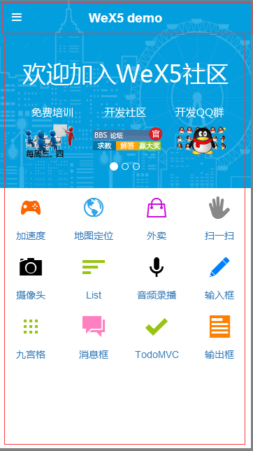
1、导航多页面样式
- 头部放titleBar组件,实现显示标题,左右区域按钮
- 中间区域往往是一个contents组件,用于多个页面的切换
- 尾部往往结合buttonGroup组件,用于导航中间区域页面的切换。
案例请参考外卖,实现效果如图:

.w主要代码实现:
  <div component="$UI/system/components/justep/panel/panel"
    class="x-panel x-full" xid="panel1">
    <div class="x-panel-top" xid="top1">
      <div component="$UI/system/components/justep/titleBar/titleBar"
        xid="titleBar2" class="x-titlebar">
        <div class="x-titlebar-left" xid="div4"/>
        <div class="x-titlebar-title" xid="div5"/>
        <div class="x-titlebar-right reverse" xid="div6"/>
      </div>
    </div>
    <div class="x-panel-content" xid="content1">
      <div component="$UI/system/components/justep/contents/contents"
        class="x-contents x-full" active="0" xid="contents1">
        <div class="x-contents-content" xid="content2">
          <!--页面1-->
        </div>
        <div class="x-contents-content" xid="content3">
          <!--页面2-->
        </div>
      </div>
    </div>
    <div class="x-panel-bottom" xid="bottom1">
      <div component="$UI/system/components/justep/button/buttonGroup"
        class="btn-group" tabbed="true" xid="buttonGroup1">
        <a component="$UI/system/components/justep/button/button"
          class="btn btn-default" label="button" xid="button1" target="content2">
          <i xid="i1"/>
          <span xid="span1"/>
        </a>
        <a component="$UI/system/components/justep/button/button"
          class="btn btn-default" label="button" xid="button2" target="content3">
          <i xid="i2"/>
          <span xid="span2"/>
        </a>
      </div>
    </div>
  </div>
2、单页显示
- 这种样式比较简单,只保留头部和中间部分,在bottom上点右键,再点删除即可
.w主要代码实现:
  <div component="$UI/system/components/justep/panel/panel"
    class="x-panel x-full" xid="panel1">
    <div class="x-panel-top" xid="top1">
      <div component="$UI/system/components/justep/titleBar/titleBar"
        class="x-titlebar" xid="titleBar2">
        <div class="x-titlebar-left" xid="div4"/>
        <div class="x-titlebar-title" xid="div5"/>
        <div class="x-titlebar-right reverse" xid="div6"/>
      </div>
    </div>
    <div class="x-panel-content" xid="content1">
      <!--页面显示主要内容-->
    </div>
  </div>
3、头部随页面切换而变化
- 放置一个无头有脚(组件右键将top删除)的panel组件
- 底部放buttongroup组件用于导航
- 中间区域放置一个contents组件,添加多个content,在每个content中放置一个有头无脚(将bottom删除)的panel组件
.w主要代码实现:
  <div component="$UI/system/components/justep/panel/panel"
    class="x-panel x-full" xid="panel1">
    <div class="x-panel-content" xid="content1">
      <div component="$UI/system/components/justep/contents/contents"
        class="x-contents x-full" xid="contents1">
        <div class="x-contents-content" xid="content1">
          <div component="$UI/system/components/justep/panel/panel"
            class="x-panel x-full" xid="panel2">
            <div class="x-panel-top" xid="top2">
              <!--放置titleBar,titleBar上显示标题,添加按钮操作页面1-->
              <div component="$UI/system/components/justep/titleBar/titleBar"
                class="x-titlebar" xid="titleBar2">
                <div class="x-titlebar-left" xid="div4"/>
                <div class="x-titlebar-title" xid="div5"/>
                <div class="x-titlebar-right reverse" xid="div6"/>
              </div>
            </div>
            <div class="x-panel-content" xid="content2">
              <!--页面1显示内容-->
            </div>
          </div>
        </div>
        <div class="x-contents-content" xid="content2">
          <div component="$UI/system/components/justep/panel/panel"
            class="x-panel x-full" xid="panel3">
            <div class="x-panel-top" xid="top3">
              <!--放置titleBar,titleBar上显示标题,添加按钮操作页面2-->
              <div component="$UI/system/components/justep/titleBar/titleBar"
                class="x-titlebar" xid="titleBar3">
                <div class="x-titlebar-left" xid="div7"/>
                <div class="x-titlebar-title" xid="div8"/>
                <div class="x-titlebar-right reverse" xid="div9"/>
              </div>
            </div>
            <div class="x-panel-content" xid="content3">
              <!--页面2显示内容-->
            </div>
          </div>
        </div>
      </div>
    </div>
    <div class="x-panel-bottom" xid="bottom1">
      <div component="$UI/system/components/justep/button/buttonGroup"
        class="btn-group" tabbed="true" xid="buttonGroup1">
        <a component="$UI/system/components/justep/button/button"
          class="btn btn-default" label="button" xid="button1" target="content2">
          <i xid="i1"/>
          <span xid="span1"/>
        </a>
        <a component="$UI/system/components/justep/button/button"
          class="btn btn-default" label="button" xid="button2" target="content3">
          <i xid="i2"/>
          <span xid="span2"/>
        </a>
      </div>
    </div>
  </div>
4、拥有头部时,中间区域的图片从最上面开始显示
- 如平台首页中的代码实现:UI2/portal/sample/main/main.w,从头部开始显示图片
.w主要代码实现:
<div component="$UI/system/components/justep/panel/panel"
	class="x-panel x-full x-portal"
    xid="panel1">
    <div class="x-panel-top" xid="top1">
		<!--头部显示内容-->
	</div>
	<div class="x-panel-content xui-hignlight-selected x-scroll-view"
	xid="content1"
	style="bottom: 0px;">
		<!--中间显示内容-->
	</div>
</div>
主要代码实现:
/*
.iosstatusbar用于苹果手机,.no-iosstatusbar 用于非苹果手机,
app在手机运行时会自定生成这个class样式
.css中设置中间区域向上偏移20px,
*/
.iosstatusbar .x-portal.x-panel >.x-panel-content{
	top:0 !important;
}
.no-iosstatusbar .x-portal.x-panel >.x-panel-content{
	top:-20px!important;
}
源代码请参考版本中模型相关:
外卖中的panel布局:/UI2/takeout/index.w
图片从最上面开始显示:/UI2/portal/sample/main/main.w
panel页面显示其他.w:/UI2/system/components/justep/panel/demo/panel.w
本文由WeX5君整理,WeX5一款开源免费的html5开发工具,H5 App开发就用WeX5!
阅读其他app 开发相关文章:http://doc.wex5.com/?p=3443
评一波